
Diagram 5 of Royce70's Diagrams should be two diagrams and represent the amount of effort more faithfully.
(Double-click to enlarge)
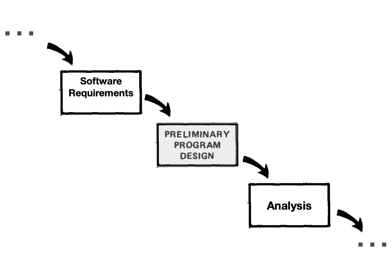
The Preliminary Program Design phase is new, but that's not visually obvious. (Is it new? Or is he just highlighting the preexisting phase he wants to talk about in this section of the paper)
It would be better if there were two diagrams.
The first highlights the newness of Preliminary Program Design and shows its position between the preceding Software Requirements phase and the following Analysis phase.
I would omit all other phases but those three, perhaps showing their existence with ellipses.
(Double-click to enlarge)
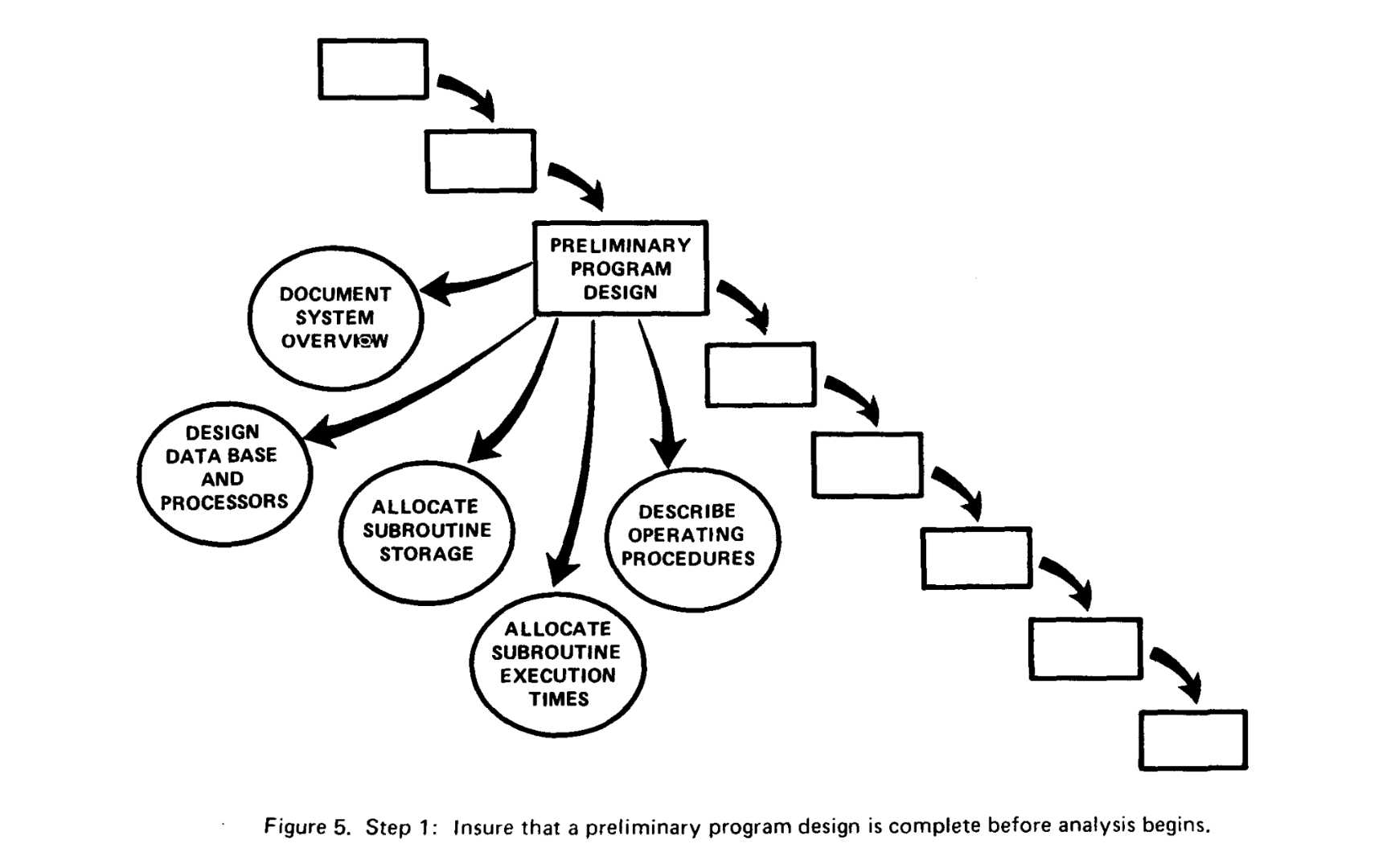
Now consider the set of five tasks Royce recommends:
(Double-click to enlarge)
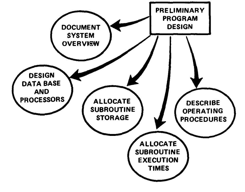
There are *components* of the Preliminary Program design, but they're presented as separate objects pointed to by arrows not dissimilar to the earlier movement-through-time arrows.
It would be better if they were *nested* within a box labeled Preliminary Program Design. Containment ![]() is one of the most fundamental metaphors, and I'd make the picture fit the metaphor. Alternately, I suppose, you could label the figure as an "exploded view" of the Preliminary Program Design, as readers will have been trained to understand that means that what is normally inside has been extracted to the outside for viewing convenience.
is one of the most fundamental metaphors, and I'd make the picture fit the metaphor. Alternately, I suppose, you could label the figure as an "exploded view" of the Preliminary Program Design, as readers will have been trained to understand that means that what is normally inside has been extracted to the outside for viewing convenience.
"Insure that a preliminary program design is complete before analysis begins" is not a caption that really conveys that.
----
I also want to note that the waterfall phases are presented in a pleasing, symmetrical, well-spaced way throughout the paper. The circles in this diagram are not. They're randomly scattered, and the arrows don't "hit" their target in a consistent way.
The effect is to make Royce's *solution* less visually appealing than the *problem* (the "simplistic" waterfall). The effect minor so far, but it compounds, I think, throughout Royce70's Diagrams,
---
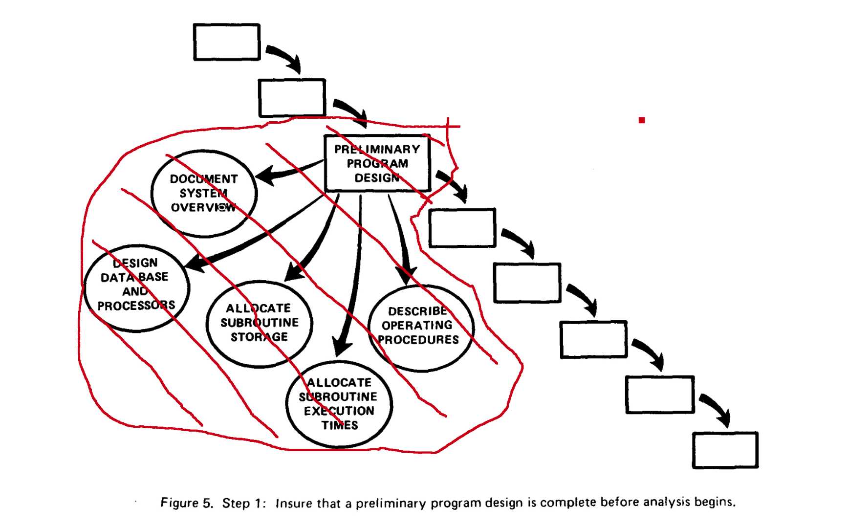
Now consider the area of the new work Royce is proposing compared to the area of the older phases:
(Double-click to enlarge)
The individual tasks are larger than entire phases, and this new phase is visually larger than *everything else*. Yeah, sure, *rationally* you know work isn't proportional to physical dimension, but that's the way the physical world has taught us to habitually react. A bigger pile of sand is more work to move; a thicker board takes longer to saw through.
Therefore, I claim, this is another subliminal message that the cure is distasteful compared to the disease.