
Stepping through the diagrams in Royce 1970, we can see they make the bad solution look good and the good solution look bad.
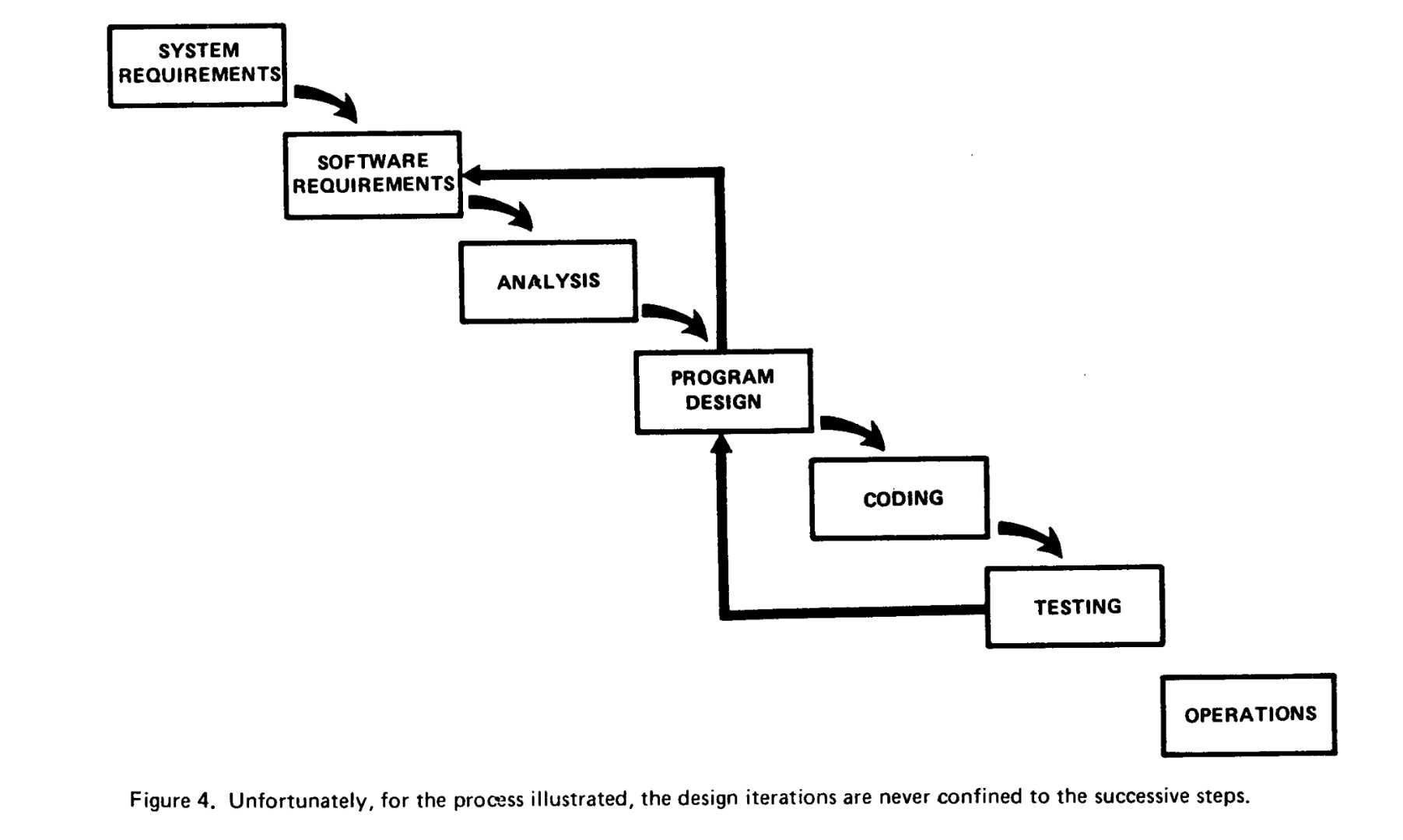
Royce70 and Rework covers the diagrams up through his figure 4, which looks like this:
Double-click to enlarge
Here I'll cover the cumulative effect of his diagrams, summarized as Royce70 Diagram Lessons.
Royce70 Diagram 5 adds a new phase, but in an unappealing way.
Royce70 Diagram 6 is not substantively different in effect than Diagram 5, but it would be better if it weren't a diagram at all.
Royce70 Diagram 7 is a good one. Good use of the Visual Chunk.
Royce70 Diagram 8 doesn't add much. Included if you want to look at it.
Royce70 Diagram 9 adds checkpoints. Interestingly, they break up the waterfall "chunk."
The end result is Diagram 10, which juxtaposes figure 4 (the problem) to his solution:
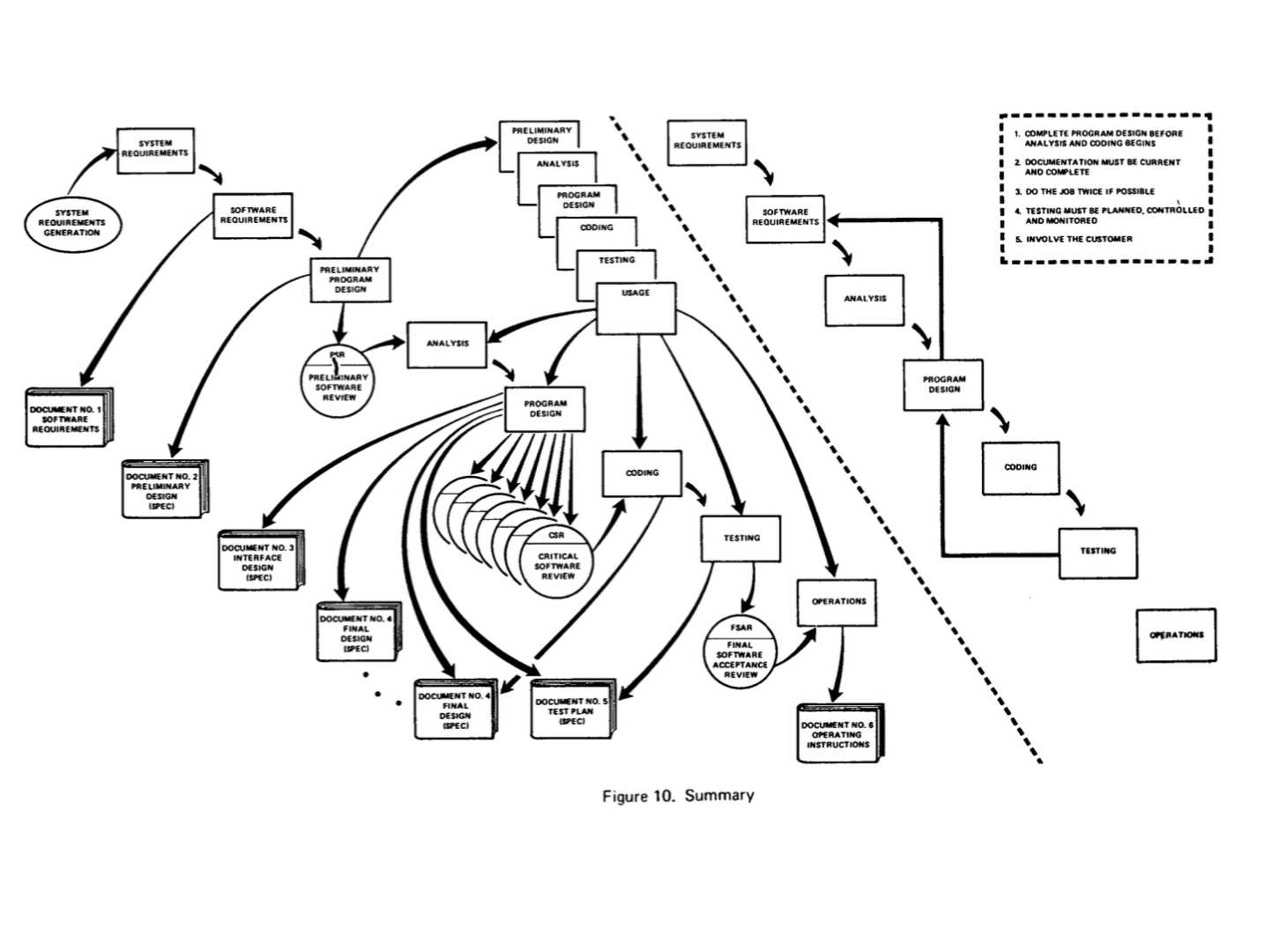
Double-click to expand
I know what Royce is doing. He’s showing the thoroughness of his solution, how it covers so many contingencies and risks. However, the unity of the waterfall is broken up and the overwhelming impression (to me) is of barely-controlled complexity. The waterfall – the *incorrect* waterfall – on the right side of the diagram looks *way* more appealing, angular arrows demonstrating its big problem be damned.