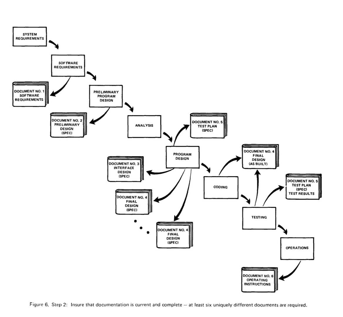
Diagram 6 from Royce 1970 spreads the new elements out more than Royce70 Diagram 5, but has a similar effect.

Double-click to enlarge
I notice in particular that eight central phases have a more pleasing structure – consistent spacing and organization. They form a Visual Chunk. They're part of the same thing – the waterfall.
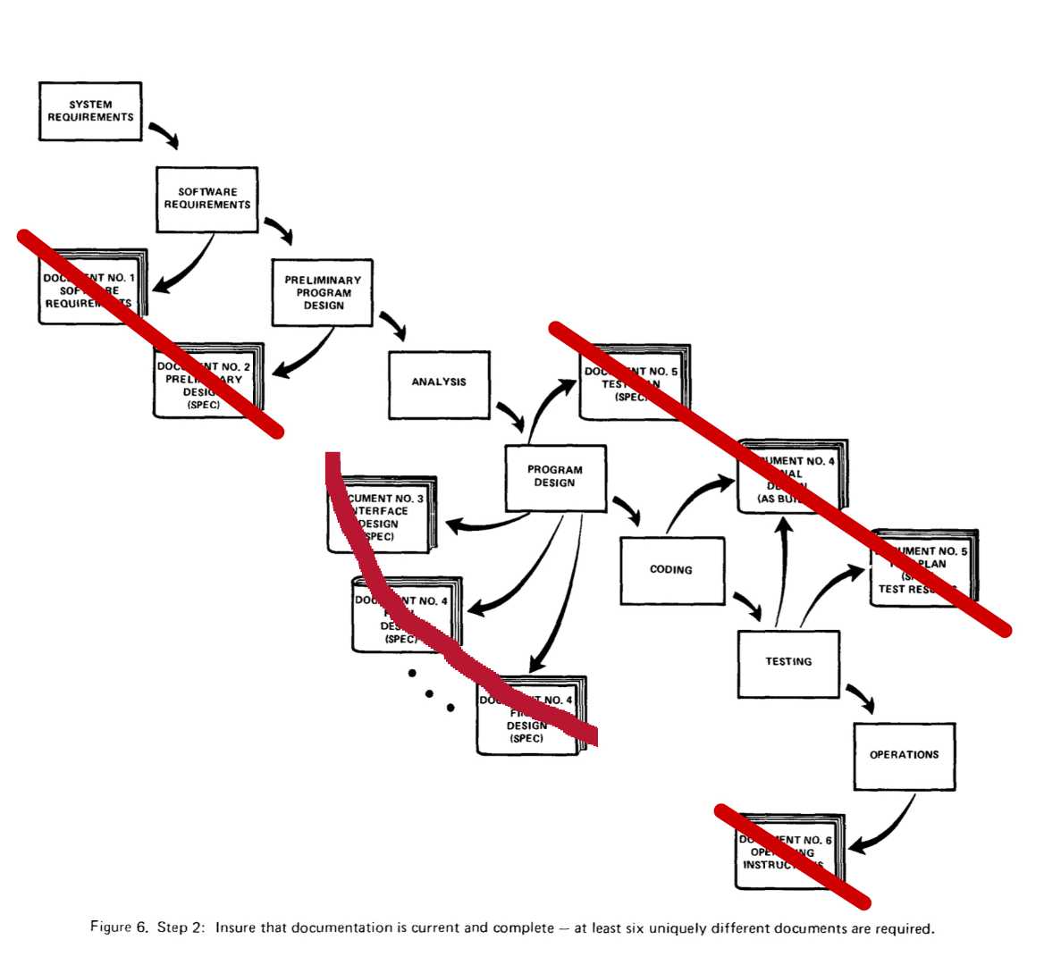
The stylized document binders don't form a cohesive whole, but rather four chunks:

(Double-click to enlarge)
This provides a sense of clutter, including because there's no visually obvious relationship between the arrows and the underlying waterfall. One chunk comes from a single phase, whereas another comes from two. Most of the documents have have one arrow from a phase, but one document in one chunk has two arrows from two different phases. What's up with that?
This diagram would be better as a list, which would allow Royce to easily provide a bit more information than he does. See Documentation Appropriate to Each Phase.
Translating the documentation raised questions that the existing text did not answer. I thought of the more obvious questions when I first walked through the figure and read all the labels. But some of them – perhaps most – occurred only as I tried to explain the document.
It's a cliché that many people only discover what they think as they write it down ![]() . I'm certainly one of them, though I usually have to write it in four different ways before I discover what I think.
. I'm certainly one of them, though I usually have to write it in four different ways before I discover what I think.
That is, writing is a *knowledge-discovery* or *sense-making* tool, a type of explanation that is *generative*. Drawing boxes and arrows can do the same, but I wonder if the *type* of knowledge discovered may tend to vary between the methods.
---
See also Your Brain Is Not on Your Side.